
The Bear King
Become the leader you were born to be.

A rather fun and invigorating piece I illustrated for a good friend of mine as it was his birthday. It’s not much of a far cry from my usual style or theme, but I wanted to try something different, like a Frank Frazetta black and white illustration but with my own flair.
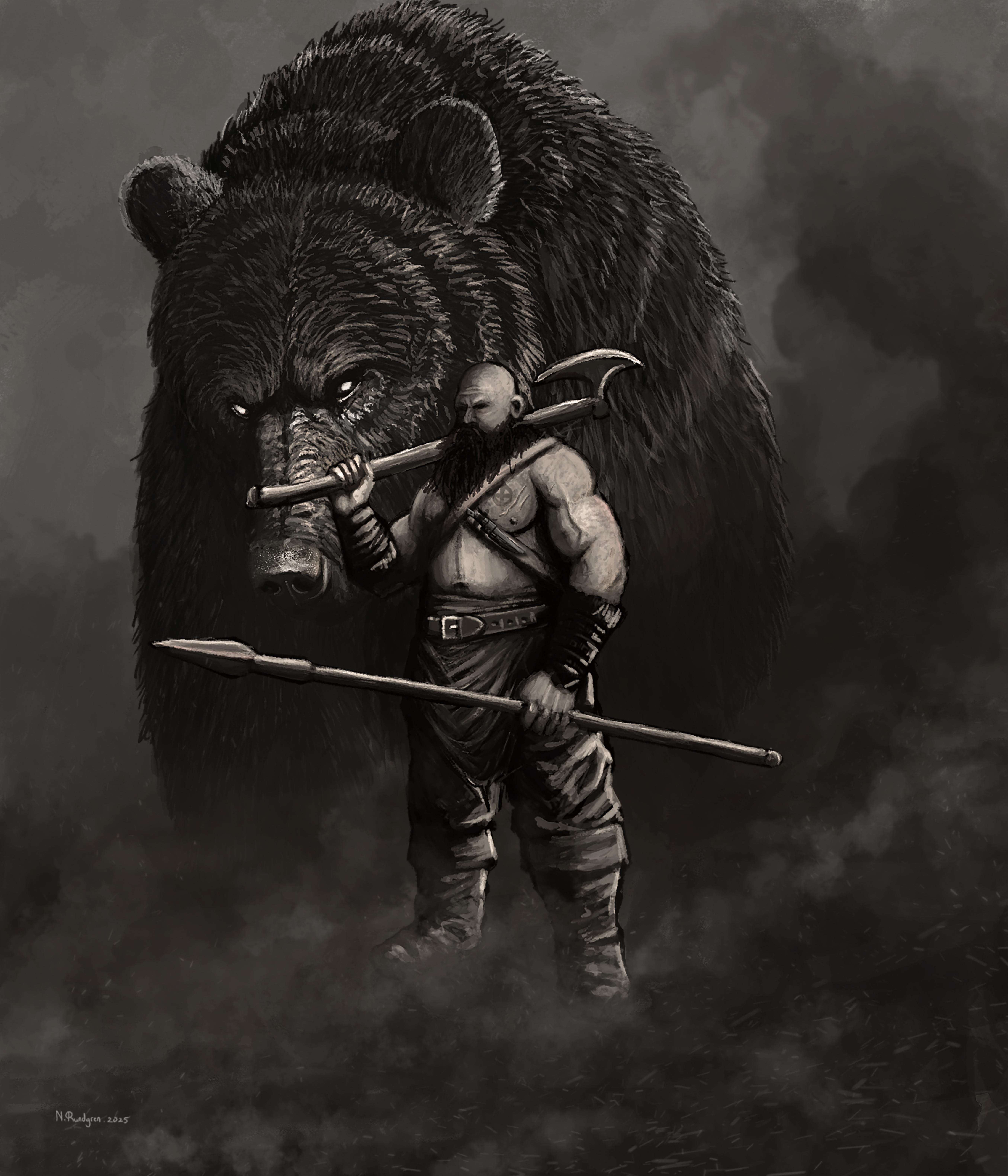
Representing my friend’s proud Gaelic heritage, I combine his overall likeness to the archetypal barbarian or Man of the Mountain, enveloped by ominous mist within a dark setting. An enormous grizzly bear looms behind him, accentuating the cool factor of the illustration + he embodies the ferocity of the bear.
I am particularly proud of this illustration because I completed in three days as opposed to the usual 2 months to finish a painting.
Anyway, check out the short process of the illustration, though I didn’t record anything because I had to finish it quickly.
Step one is sketch a rough draft of the illustration.
Step two is to block in the basic colours (in this case neutral) & shapes to frame the composition.
At this stage I began illustrating from the bottom up because, due to my deadline, I painted the easiest features of my subject - such as his boots and pants. Likewise I painted both weapons to get them out the way. Overall, the process is rather simple as I am using neutral colours (black, white & grey) making it surprisingly easier to paint/illustrate than a colour painting. The only rule here is to ensure both light & shadow are correct; those are my crucial focal points. So the shading is really important here.
The illustration is beginning to take shape as I blocked in the colours of the loin cloth, wrist guards and the many belts and straps.
How many you say?
Yes!
I then proceeded to illustrate the bandoliers - adding a knife the one - followed by his chest, arms, hands and legs. Surprisingly this was easier than I thought because I do struggle to achieve the right tones but not this time. Finally I added some colour to his head, shading it accordingly to my light source, which is in the upper-right corner.
Next up, the bear. I begin illustrating the bears snout, giving it a lovely rough & gruff texture, combined with short fur, scars, scratches, grooves and indents. I wanted the bear’s eyes to be pure white to give him a “spectre” vibe, I suppose. Slowly but surely I began to apply the base colour (mostly black) due to the dark them for which I’m going, followed by two layers of highlights. So black, grey (as well as other shades of grey) then white.
At this point I had to clean up the edges or contours of the bear just to polish & refine, making the bear look reasonably coated.

The final result.
I worked a little more on the background, added smoke & dust to enhance the dark theme, as well as hiding the feet of both subjects. A few sparks and embers to compete the final touch-up before signing off.
Overall, one of the easiest illustrations I’ve drawn.
Thank you for taking the time to read this post.
Neale Rundgren
In the meantime, check out my store and other social media platforms.
Portfolio: https://artofnealerundgren.artstation.com/
Store: https://artofnealerundgren.artstation.com/store/art_posters
Instagram: https://www.instagram.com/art_of_neale_rundgren/